

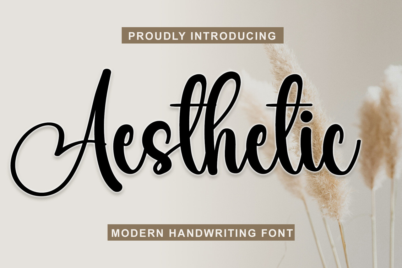
In the digital world, the way words look can be just as important as what they communicate. From Instagram bios and WhatsApp statuses to journal pages, digital invitations, and personalized notes, creative lettering has become a popular way to express personality. Many people enjoy experimenting with different fonts, symbols, spacing, and decorative elements to make ordinary text look more attractive. This growing interest has made tulisan aesthetic a familiar concept among people who want their written content to feel stylish, expressive, and memorable.
Aesthetic writing is not limited to a particular age group or creative community. Students use decorative lettering in their notes, content creators design eye-catching captions, and small business owners experiment with distinctive typography to make their brands look more appealing. Even a simple name can appear completely different when presented in a cursive, minimalist, bold, or vintage-inspired style. These small visual changes can help communicate a mood, whether someone wants to appear elegant, playful, artistic, or professional.
The best part is that creating attractive text does not always require advanced graphic design skills or expensive software. With a little creativity and an understanding of typography, anyone can transform everyday writing into something more personal. The key is choosing a style that suits the message, maintaining readability, and avoiding unnecessary decoration. Understanding these principles makes it easier to create text that looks beautiful while remaining useful across different digital platforms.
What Is Tulisan Aesthetic?
Tulisan aesthetic refers to writing that uses visually appealing lettering, typography, symbols, spacing, and decorative details to create a particular appearance. The Indonesian word “tulisan” means writing or text, while “aesthetic” describes something appreciated for its visual beauty or artistic quality. Together, the expression generally refers to stylish text that communicates a message while also creating a pleasing visual impression.
This type of writing can take many forms. Some designs use elegant cursive letters that resemble handwriting, while others rely on clean, modern characters with generous spacing. Decorative stars, hearts, flowers, and subtle symbols may also be added to enhance the appearance of a phrase. For example, a simple greeting such as “Have a beautiful day” can feel more personal when written in a delicate script or surrounded by small decorative elements. However, aesthetic writing is not necessarily complicated. Sometimes a clean font, balanced spacing, and carefully chosen capitalization produce a more attractive result than an elaborate design.
Another important feature is flexibility. Aesthetic text can be created by hand, designed with a digital typography application, or generated using online text-conversion tools. Each approach offers different possibilities. Hand lettering provides a personal touch, while digital tools make it easier to experiment with multiple styles quickly. The most suitable method depends on the purpose of the text, the platform where it will appear, and the amount of customization required.
Popular Styles of Aesthetic Writing
Elegant Cursive and Script Lettering
Cursive lettering is one of the most recognizable styles because its flowing lines create a graceful, handwritten appearance. It is particularly suitable for names, romantic messages, journal headings, wedding invitations, and short inspirational phrases. The connected shapes of cursive characters can make ordinary words feel more personal, especially when combined with soft colors and generous spacing.
However, cursive lettering works best when used thoughtfully. Long sentences written entirely in decorative script can become difficult to read, especially on smaller mobile screens. A practical approach is to use cursive for a short heading or a person’s name and keep the remaining text in a simple font. This combination creates visual contrast without sacrificing clarity.
Minimalist and Clean Typography
Minimalist typography focuses on simplicity, balance, and readability. Instead of relying on elaborate symbols or complex letterforms, it uses straightforward characters, consistent spacing, and a restrained visual approach. This style works well for professional profiles, study notes, product descriptions, personal journals, and modern digital designs.
Minimalist lettering is also easy to combine with other visual elements. A short phrase in a clean font can look attractive alongside a neutral background, a small illustration, or a simple border. Because it avoids unnecessary decoration, this approach remains versatile across different platforms and audiences.
Cute and Playful Text Designs
Playful lettering often includes hearts, stars, flowers, soft punctuation, and decorative characters. It is commonly used for friendly messages, personal bios, fan communities, creative usernames, and informal social media captions. These details can communicate warmth and enthusiasm without requiring a complicated design.
The important consideration is balance. Adding a few symbols can make a phrase more expressive, but filling every space with decorative characters may distract readers from the actual message. A short caption with one or two well-placed symbols often feels more polished than text surrounded by excessive decoration.
Bold, Gothic, and Vintage-Inspired Styles
Bold lettering creates a strong visual presence, making it suitable for headings, announcements, gaming profiles, and attention-grabbing captions. Gothic-inspired characters offer a more dramatic appearance, while vintage lettering can evoke nostalgia through distinctive shapes and traditional design influences. These styles are useful when the goal is to communicate confidence, mystery, individuality, or a recognizable creative identity.
The choice should reflect the intended audience. A dramatic typeface may work well for a gaming username or artistic project, but it may be inappropriate for a formal business profile. Choosing typography based on context ensures that the design supports the message instead of competing with it.
How to Create Attractive Text Designs
Creating tulisan aesthetic starts with a clear idea of what the text should communicate. Before selecting a font or adding symbols, consider the purpose of the content. A romantic caption might benefit from flowing letters, whereas a study heading may be easier to understand in a clean and structured style. Identifying the intended mood first helps narrow down the available design choices and prevents unnecessary experimentation.
Once the purpose is clear, try different lettering styles and compare their appearance. Pay attention to letter shapes, spacing, capitalization, and the relationship between decorative elements and the main text. A phrase that looks attractive in a large preview may appear crowded when displayed on a phone. Testing the final design at its intended size helps identify readability problems before the text is published.
The following practical steps can make the process easier:
-
Choose a style that matches the message, audience, and platform.
-
Keep decorative symbols limited and consistent.
-
Check how the text appears on mobile and desktop screens.
-
Use simple lettering for longer messages and complex styles for short phrases.
Experimentation is valuable, but consistency matters too. When designing a social media profile, for example, using similar typography across the biography, highlights, and captions can create a more recognizable visual identity. For personal projects, consistency can make digital journals, planners, and creative collections look organized without removing their individual character.
Choosing the Right Style for Different Platforms
Different digital platforms have different expectations for written content. Instagram profiles often benefit from short, expressive text that communicates personality quickly. WhatsApp statuses may use playful lettering or symbols to convey a feeling in just a few words. Meanwhile, Pinterest graphics, digital invitations, and promotional designs may allow greater freedom because the text can be arranged directly within a visual layout.

When using tulisan aesthetic on social media, readability should remain a priority. Some decorative Unicode characters resemble familiar letters but are technically different characters. Although they may appear stylish, they can create problems with screen readers, text searching, copying, or automatic translation. Certain platforms may also display unfamiliar characters as empty boxes or inconsistent symbols.
A useful strategy is to reserve decorative lettering for names, short phrases, and selected headings. Keep important information, contact details, instructions, and longer descriptions in standard text. This approach provides a balance between appearance and accessibility, helping more people understand the content regardless of their device or reading preferences.
| Platform or purpose | Recommended style | Main consideration |
|---|---|---|
| Instagram bio | Minimalist or cursive | Keep the profile easy to scan |
| WhatsApp status | Cute or expressive | Match the mood of the message |
| Digital journal | Handwritten or elegant | Maintain comfortable readability |
| Business profile | Clean and professional | Prioritize clarity and trust |
| Invitations | Script or vintage | Match the theme of the event |
| Gaming username | Bold or gothic | Check character support and display |
The table illustrates a general principle: no single font style works equally well everywhere. The best choice depends on the platform, the message length, and the people expected to read it. A decorative username may be memorable, while the same lettering could make an important announcement unnecessarily difficult to understand.
Using Digital Tools for Stylish Lettering
Digital typography tools have made creative text design more accessible. Many applications provide font previews, text effects, symbol libraries, and templates that help beginners explore different appearances without learning professional design software. Some tools generate alternative Unicode characters, while others allow users to select installed fonts and customize the appearance of text within an image.
Text generators can be useful when someone needs a quick result for a profile or caption. A user can enter a word, review several variations, and copy a preferred design. Nevertheless, generated text should always be checked before use. Some characters may look similar but behave differently, and a style supported on one device might not render correctly on another. Testing the text in its intended destination is therefore an important final step.
For more elaborate projects, graphic design applications offer greater control over typography, color, alignment, and background elements. These features are useful for posters, invitations, thumbnails, and promotional material. Designers can adjust line spacing, combine contrasting fonts, and create a complete visual composition rather than relying on decorative characters alone.
It is also worth understanding the difference between a font and a Unicode text style. A font changes how supported characters are visually displayed, while Unicode-based generators may replace ordinary characters with different encoded characters. This distinction matters because Unicode variations are not always accessible, searchable, or supported consistently. For professional and accessibility-sensitive content, conventional fonts are generally the safer option.
Common Mistakes to Avoid
One frequent mistake is using too many decorative elements in a single design. Multiple font styles, symbols, unusual spacing, and contrasting visual effects can compete for attention. Instead of making the message more attractive, these elements may create clutter. Limiting a design to one primary style and one complementary accent usually produces a more cohesive result.
Another issue is choosing appearance over readability. Highly stylized characters can be difficult to recognize, especially when used in long paragraphs or small text fields. This can frustrate readers and reduce the usefulness of the content. If a phrase takes extra effort to understand, simplifying the typography may improve the overall result.
Inconsistent styling can also weaken a design. For example, combining a delicate cursive font with an unrelated heavy display style may look unbalanced unless there is a clear visual reason for the contrast. Similarly, excessive capitalization or uneven spacing can make otherwise attractive lettering appear unpolished. Reviewing the complete design rather than individual words helps reveal these problems.
Finally, remember that digital platforms change their features and rendering behavior over time. A style that works perfectly today may appear differently after a device update or platform redesign. Checking important profile text and promotional content occasionally can help maintain a consistent appearance. For business communication, accessibility and accurate information should always take priority over decoration.
Creative Ideas for Personal Expression
Aesthetic lettering can be used for much more than social media profiles. Students can use different heading styles to separate subjects in digital notes, making their study material more organized and enjoyable to review. Writers can experiment with distinctive titles for personal essays, poetry collections, or reading journals. People who enjoy planning can create personalized labels for calendars, habit trackers, and daily schedules.

Creative text can also support small business branding. A handmade-product seller, for instance, might use a consistent lettering style on packaging labels, product cards, and promotional graphics. A content creator may choose a recognizable title treatment for video thumbnails and digital posts. These applications show how typography can help establish visual consistency without requiring elaborate illustrations or complicated layouts.
Another idea is to create themed collections of phrases. Someone might develop a set of motivational quotes using clean lettering, a collection of friendship messages with playful symbols, or a series of seasonal greetings using vintage-inspired typography. Such projects encourage experimentation while helping the creator develop a recognizable style.
The goal is not to follow every popular design trend. Trends can provide inspiration, but personal preferences and practical needs should guide the final decision. A design becomes more meaningful when it reflects the creator’s personality and communicates the intended message clearly.
The Future of Aesthetic Text Design
Digital design continues to evolve as creative applications introduce improved font libraries, automated layout features, and artificial intelligence-assisted design tools. These developments make it easier for beginners to explore typography and generate ideas for different projects. Users can experiment with combinations of letterforms, colors, and layouts more quickly than before, while experienced designers can use automation to accelerate routine tasks.
At the same time, the increasing volume of digital content makes originality and clarity more valuable. Simply choosing an unusual font may not be enough to make a design memorable. The relationship between the words, visual hierarchy, spacing, and intended audience plays a major role in determining whether the final result feels effective. Thoughtful typography can make a simple message stand out without overwhelming the reader.
Accessibility is also likely to remain an important consideration. As more people consume content through assistive technologies and across different screen sizes, designers need to think beyond visual appearance. Standard text, readable contrast, clear hierarchy, and appropriate alternative descriptions for image-based lettering can help make creative content available to a wider audience.
These developments suggest that the most useful design skills will combine creativity with practical judgment. Learning how to select suitable fonts, organize text, and evaluate readability can help people produce more effective designs regardless of which tools become popular next.
Conclusion
Tulisan aesthetic offers a simple and creative way to transform ordinary writing into something more expressive. From elegant cursive and minimalist typography to playful symbols and bold vintage-inspired lettering, different styles provide opportunities to communicate personality and establish a distinctive visual identity. The right choice depends on the message, the intended audience, and the platform where the text will appear.
Creating attractive lettering does not require expensive tools or advanced technical knowledge. Starting with a clear purpose, testing different styles, maintaining consistent spacing, and avoiding excessive decoration can produce impressive results. Digital generators and design applications provide convenient ways to experiment, but readability and accessibility should always remain part of the decision-making process.
Ultimately, the value of tulisan aesthetic lies in its ability to combine visual appeal with meaningful communication. Whether it is used for a social media biography, a personal journal, a creative project, or a business design, thoughtful lettering can make written content feel more personal and memorable. By focusing on balance, originality, and clarity, anyone can develop a style that looks appealing while communicating effectively.