

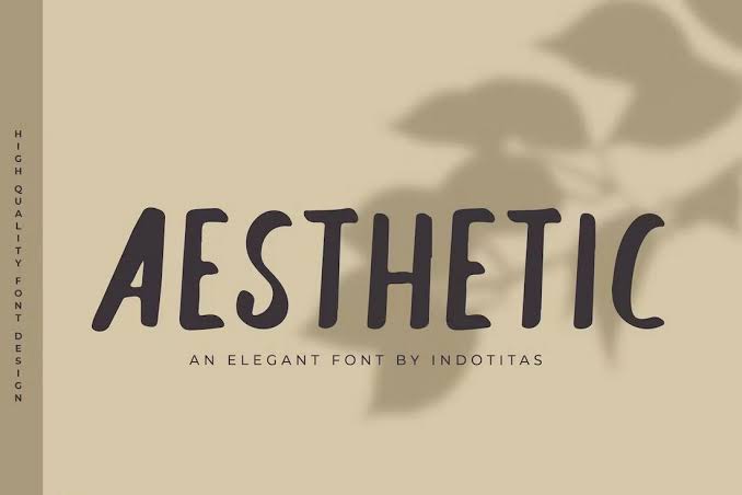
Typography has become an essential part of digital communication, influencing how people express their personalities, present their ideas, and build recognizable online identities. From social media biographies and creative usernames to website headings and digital invitations, the appearance of text can make a significant difference in how a message is received. A well-chosen aesthetic font can transform ordinary words into visually appealing elements that communicate a particular mood, personality, or creative direction. Whether someone prefers minimalist lettering, elegant scripts, retro typography, or playful decorative characters, the right style can help make digital content more memorable.
The growing popularity of visual platforms has also encouraged individuals, content creators, designers, and businesses to experiment with different lettering styles. Instead of relying exclusively on standard text, people now pay greater attention to how their words look alongside images, colors, layouts, and other design elements. This interest is not limited to professional graphic design. Students use decorative text in presentations, creators personalize their profiles, and small businesses develop distinctive visual identities through consistent typography. Understanding how different styles work makes it easier to select lettering that looks attractive while remaining readable and appropriate for its intended purpose.
What Is an Aesthetic Font?
An aesthetic font is a lettering style chosen for its visual appeal, distinctive personality, and ability to create a particular atmosphere. It may look elegant, modern, romantic, futuristic, playful, vintage, or artistic, depending on its design. Some styles feature thin strokes and generous spacing, while others use bold shapes, flowing curves, unusual proportions, or decorative details. The goal is to make written content visually engaging without losing the meaning of the message.
In everyday digital use, the term can refer to traditional typefaces, decorative lettering, or Unicode characters that resemble specially styled text. These options are not technically identical. A typeface changes how text is rendered within a design application, whereas Unicode-based text generators may replace ordinary letters with different characters that look stylized. This distinction matters because decorative characters may not display consistently across every device, platform, or assistive technology. Understanding the difference helps users choose a solution that balances creativity, compatibility, and accessibility.
Why Stylish Typography Matters in Modern Digital Content
Creating a Strong First Impression
Visual presentation often influences whether someone notices a piece of content or scrolls past it. Typography contributes to that first impression by establishing a tone before the audience has read the entire message. Elegant lettering can make a wedding invitation feel sophisticated, while thick geometric characters can give a technology brand a confident and contemporary appearance. Even small changes in letter spacing, weight, and shape can affect the overall personality of a design.
However, attractive typography does not automatically guarantee effective communication. A design should support the message rather than compete with it. For example, a fashion portfolio may benefit from refined serif lettering, while a gaming channel might use energetic display typography. Selecting a style that matches the subject creates a more coherent experience and helps viewers understand the intended mood without unnecessary explanation.
Building a Consistent Online Identity
Consistency is particularly valuable for people who publish content regularly. Using similar typography across profile graphics, video covers, promotional materials, and website headings can create a recognizable visual identity. Audiences gradually become familiar with repeated design choices, especially when typography works alongside consistent colors, imagery, and language.
An aesthetic font can contribute to this identity, but it should be selected with practical considerations in mind. A creator who uses extremely decorative characters for every caption may find that readers struggle to understand the content. A better approach is to reserve distinctive lettering for names, short headings, or important phrases while keeping longer passages in a clean, readable typeface. This combination creates visual interest without sacrificing clarity.
Popular Typography Styles for Different Creative Needs
Different lettering styles communicate different feelings, so the best choice depends on the audience, platform, and purpose of the content. Some designs emphasize simplicity, while others focus on ornamentation or unusual visual effects. Exploring these categories can help users discover a style that suits their creative goals.
| Typography style | Visual characteristics | Suitable applications |
|---|---|---|
| Minimalist | Clean shapes and balanced spacing | Websites, portfolios, presentations |
| Script | Flowing, handwritten letterforms | Invitations, signatures, creative graphics |
| Serif | Distinctive finishing strokes | Editorial designs, luxury branding |
| Sans serif | Simple, modern letterforms | Apps, business content, social media |
| Retro | Nostalgic shapes and decorative details | Posters, themed graphics, merchandise |
| Gothic | Dramatic, angular, elaborate forms | Music artwork, alternative aesthetics |
| Rounded | Soft edges and friendly proportions | Lifestyle content, educational designs |
| Futuristic | Geometric forms and technological details | Gaming, science, technology projects |
Minimalist and Modern Typography
Minimalist typography focuses on simplicity, balance, and legibility. It usually avoids excessive decoration, allowing the shape of each letter and the spacing between characters to create the visual effect. This approach works particularly well for portfolios, modern websites, product presentations, and professional social media graphics. Its restrained appearance can make a design feel organized and sophisticated.
Modern sans serif typefaces are often useful when content needs to look clean across different screen sizes. Their straightforward forms generally remain readable in small headings and interface elements. Designers can introduce personality through font weight, letter spacing, alignment, and contrast rather than relying on elaborate symbols. This makes minimalist lettering a practical choice for projects where both appearance and usability matter.
Elegant Script and Romantic Lettering
Script typography imitates the movement of handwriting, often using connected strokes, flowing curves, and expressive shapes. It can create a personal and graceful atmosphere, making it suitable for greeting cards, wedding stationery, lifestyle branding, and artistic quotations. Some script styles are delicate and understated, while others are dramatic and highly decorative.
The main challenge is readability. Elaborate scripts may look beautiful in a short title but become difficult to follow in lengthy paragraphs. When using this style, it is generally better to limit it to a name, a short phrase, or a prominent design element. Pairing it with a simple secondary typeface can create a balanced composition that feels expressive without overwhelming the reader.
How to Choose the Right Aesthetic Font for Your Project
Choosing suitable typography begins with understanding what the content needs to communicate. A personal profile may benefit from playful lettering, while a business presentation may require a more restrained appearance. The audience also matters. Younger audiences may appreciate expressive visual trends in certain contexts, whereas professional or informational content often benefits from straightforward typography.
Before making a final decision, test the style in the environment where it will appear. Text that looks attractive on a large computer display may become cramped on a mobile screen. Likewise, decorative symbols that display correctly in one application might appear as empty squares elsewhere. Testing the actual text helps prevent visual inconsistencies and ensures that the design remains useful after publication.
A practical selection process can include these considerations:
- Identify the mood you want to communicate, such as elegant, playful, modern, or dramatic.
- Check whether the lettering remains readable at the intended size.
- Consider compatibility with the platform, device, and design software.
- Use decorative styling selectively to keep important information clear.
These simple checks can prevent common typography problems and make the finished design more effective.
Using Decorative Typography on Social Media
Social media platforms encourage users to communicate through a combination of text, images, video, and visual identity. Distinctive lettering can help profile names, short descriptions, and promotional graphics stand out among large amounts of content. Creators may use different styles to establish themes for travel photography, fashion inspiration, gaming, fitness, music, or personal journaling.
Nevertheless, each platform handles text differently. Some profile fields accept only specific characters, while others support a broader range of Unicode symbols. Certain decorative characters may also be difficult for screen readers to interpret or search systems to process. For this reason, users should consider keeping essential names, keywords, contact information, and calls to action in standard text whenever possible. Creative lettering is most effective when it enhances discoverability and communication rather than making information harder to access.
The Role of Typography in Branding and Website Design
Businesses use typography to communicate their values and distinguish themselves from competitors. A luxury-oriented brand may select elegant serif lettering, while a digital service might choose a clean sans serif family that communicates efficiency and simplicity. A children’s learning platform may use rounded characters to create a welcoming atmosphere. These decisions influence the overall impression of the brand and should complement its visual identity.
Website typography also affects the reading experience. Headings need to establish a clear hierarchy, body text should be comfortable to read, and buttons must remain easy to recognize. Designers should consider font availability, loading performance, licensing, and responsive behavior when selecting typefaces. A visually attractive design that loads slowly or becomes unreadable on smaller screens can undermine the experience it is intended to improve.
For most websites, a limited typography system works better than using many unrelated styles. One typeface can serve headings, another can support body text, and a decorative option can be reserved for occasional highlights. This arrangement creates consistency and allows visitors to move through the content naturally.
Accessibility and Readability in Decorative Text
Accessibility deserves attention whenever typography is used to communicate important information. Highly stylized characters may be harder to distinguish for people with visual impairments, reading difficulties, or limited familiarity with particular letterforms. Low contrast, excessive spacing, and elaborate decorative strokes can make the problem worse, particularly on small screens.
A more inclusive design uses clear typefaces for essential information and introduces decorative elements where they will not interfere with comprehension. Sufficient contrast between text and background, comfortable font sizes, and appropriate line spacing can improve readability. Designers should also avoid using typography as the only way to communicate meaning. For example, an important warning should be explained in words rather than conveyed solely through an unusual letter style or visual treatment.
When choosing Unicode-based decorative text, test how it appears on different devices and consider whether assistive technologies can interpret it correctly. Maintaining a standard-text version of important information can help ensure that the message remains understandable to a wider audience.
Common Mistakes to Avoid When Styling Text
One frequent mistake is choosing an elaborate style simply because it looks impressive in isolation. A typeface may appear attractive in a sample image but become difficult to read when used for a complete paragraph. Another common issue is combining too many styles in one design, which can create visual confusion and weaken the overall identity. Limiting the number of typefaces and assigning each a clear purpose usually produces a more professional result.
Poor contrast and inconsistent spacing can also reduce the effectiveness of typography. Light lettering on a pale background may look subtle but become almost invisible on mobile devices. Similarly, using several decorative styles in a single profile or promotional graphic can make the content appear unorganized. A useful rule is to prioritize clarity first, visual personality second, and decorative complexity third. This approach makes it easier to create designs that look appealing while remaining functional.
Future Trends in Creative Typography
Digital design continues to evolve as creators experiment with variable fonts, responsive lettering, motion graphics, and AI-assisted design tools. Variable fonts allow supported typefaces to adjust characteristics such as weight and width without requiring a separate file for every variation. Responsive typography helps text adapt to different screen sizes, while motion-based lettering introduces movement into video titles, digital advertisements, and interactive experiences.
AI-assisted tools are also making it easier to explore visual concepts, generate design directions, and compare typography combinations. However, automated suggestions still require human judgment. A generated style may look distinctive but lack adequate readability, contain inconsistent letterforms, or fail to match a brand’s identity. The most effective workflow combines experimentation with careful evaluation of audience needs, technical requirements, and design principles.
As digital communication becomes increasingly visual, creative lettering is likely to remain an important part of personal expression and brand development. Successful designs will continue to balance originality with accessibility, allowing people to communicate distinctively without making their content unnecessarily complicated.
Conclusion
Typography is more than a decorative feature; it is a practical design tool that shapes how people perceive and understand written communication. From minimalist website headings and elegant invitations to expressive social media profiles, different lettering styles can communicate personality, create consistency, and strengthen visual storytelling. Choosing the right style requires attention to the message, audience, platform, and overall design.
An aesthetic font can add character to a creative project when it is used thoughtfully. By balancing visual appeal with readability, testing compatibility across devices, and maintaining consistent design choices, creators can develop content that feels distinctive without becoming difficult to understand. Whether the goal is to personalize a profile, improve a website, or establish a recognizable brand identity, thoughtful typography provides a simple yet powerful way to make digital communication more engaging.