

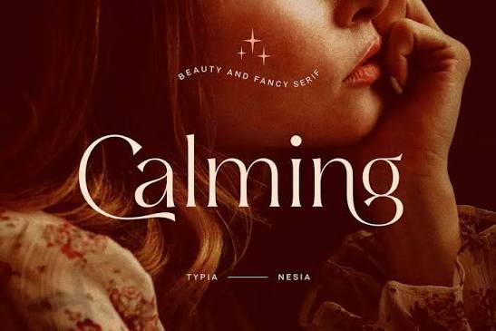
Typography has become an essential part of modern digital communication. From social media profiles and creative usernames to website layouts and digital artwork, the way words appear can influence how people perceive a message. A carefully selected font can make ordinary text feel elegant, playful, mysterious, professional, or artistic. As visual content continues to dominate online platforms, creators are paying greater attention to lettering styles that express personality and create a memorable impression. This growing interest has made font aesthetic an important consideration for anyone who wants to improve the appearance of digital content.
The appeal of decorative typography goes beyond appearance alone. Different letter shapes communicate different moods, helping creators establish a consistent visual identity across their profiles, designs, and personal projects. For example, delicate cursive lettering may suit a lifestyle creator, while bold geometric typography might work better for a technology brand. Minimalist fonts can communicate simplicity, whereas vintage-inspired lettering can introduce warmth and nostalgia. Understanding these differences makes it easier to select typography that supports the message rather than distracting from it.
Whether you are designing a website, preparing social media content, creating a digital invitation, or refreshing your personal profile, learning about typography can help you make more confident design decisions. The key is to understand how fonts work, where different styles perform best, and how to balance visual creativity with readability.
Understanding the Basics of Aesthetic Typography
Typography refers to the arrangement and presentation of letters, numbers, and other written characters. It includes font selection, spacing, alignment, size, weight, and the relationship between text and surrounding design elements. Aesthetic typography focuses particularly on the visual character of these choices. Instead of treating text as information alone, it uses lettering as an important part of the overall creative experience.
A successful font aesthetic combines appearance with purpose. A decorative typeface might look attractive in a headline but become difficult to read in a long paragraph. Similarly, a simple sans-serif font might appear ordinary when used alone but look sophisticated when paired with appropriate spacing and a complementary display font. Designers therefore consider the intended audience, platform, content length, and emotional tone before making their selections.
Another important factor is consistency. When a website, social media account, or personal brand uses compatible typography throughout its content, the overall presentation feels more organized. Consistency does not mean every design must look identical. Instead, it involves creating a recognizable visual language that allows different elements to work together naturally.
Popular Font Styles for Different Creative Moods
Elegant and Minimalist Fonts
Elegant typography often features balanced proportions, clean lines, and carefully designed letterforms. Serif fonts can create a refined editorial appearance, while lightweight sans-serif fonts often communicate modern simplicity. These styles are useful for fashion-related content, lifestyle blogs, digital portfolios, invitations, and premium product presentations.
Minimalist typography works especially well when the surrounding design already contains visual detail. A clean font allows photographs, illustrations, colors, and other elements to attract attention without competing with the text. Generous spacing and a limited color palette can further strengthen the effect. However, extremely thin lettering should be used carefully because it may become difficult to read on small screens or against low-contrast backgrounds.
Cursive and Handwritten Lettering
Cursive fonts imitate connected handwriting and often create a personal, expressive appearance. They are commonly associated with creativity, romance, friendliness, and individuality. A handwritten style can make a greeting card feel more personal or give a social media graphic a relaxed, lifestyle-oriented atmosphere.
These fonts are most effective when used selectively. A cursive heading, signature, or short highlighted phrase can add personality without overwhelming the composition. Using elaborate handwriting for an entire paragraph, however, can make the content tiring to read. Combining a decorative script with a simple body font usually creates a better balance between character and clarity.
Bold, Modern, and Geometric Fonts
Bold typography is designed to attract attention quickly. Strong letterforms, substantial strokes, and clear shapes make these fonts useful for advertisements, event posters, video thumbnails, and promotional graphics. Geometric sans-serif fonts often use simple shapes and consistent proportions, producing a contemporary appearance that suits technology, education, and digital services.
These styles can also establish a strong information hierarchy. A large, bold headline tells readers what matters most, while smaller supporting text provides context. When used thoughtfully, contrast between heavy and light typefaces makes a layout easier to scan. Excessive bold lettering, on the other hand, can reduce the impact of individual elements and make a design appear crowded.
Vintage and Retro Typography
Vintage typography draws inspiration from earlier periods of graphic design, including traditional signage, classic magazines, old advertisements, and retro packaging. Depending on the letterforms, it can feel nostalgic, artistic, playful, or sophisticated. Decorative serifs, unusual proportions, and distinctive curves often help these fonts stand apart from contemporary minimalist styles.
Retro lettering can be effective for themed events, music artwork, café branding, creative merchandise, and editorial illustrations. To keep the design polished, pair a distinctive vintage headline with simpler supporting typography. This approach preserves the nostalgic atmosphere while ensuring that important information remains easy to understand.
How to Choose the Right Typography for Your Project
Selecting a typeface should begin with the purpose of the content. A professional business website has different requirements from a personal mood board or an artistic social media profile. Before choosing a style, consider what readers should feel, what information they need to understand, and how they will view the finished design. A font that looks impressive on a desktop monitor may not remain equally clear on a small mobile display.
The intended audience also matters. Younger audiences may enjoy experimental lettering in informal content, while professional audiences may respond better to restrained and highly readable typography. These are general design tendencies rather than fixed rules, so testing different options can reveal what works best for a particular project.
A practical approach is to shortlist two or three complementary fonts and test them in the actual layout. Examine the headline, body copy, buttons, captions, and longer text blocks rather than judging the typeface by a single word. This reveals whether the font family provides enough flexibility for the complete design.
The following table summarizes common styles and their potential applications.
| Font style | Visual impression | Suitable applications |
|---|---|---|
| Serif | Classic and refined | Editorial content, formal branding |
| Sans-serif | Clean and contemporary | Websites, interfaces, business content |
| Script | Personal and expressive | Invitations, signatures, short highlights |
| Display | Distinctive and attention-grabbing | Posters, headlines, promotional graphics |
| Monospaced | Technical and structured | Code examples, technical layouts |
| Rounded | Friendly and approachable | Informal graphics, community projects |
The best option depends on the context rather than popularity alone. A font should reinforce the identity of the project, remain readable at its intended size, and work well with other visual elements.
Creating Attractive Font Combinations
Pairing Fonts Without Creating Visual Clutter
Font pairing involves selecting typefaces that complement each other while serving different purposes. A common approach is to use a distinctive font for headings and a straightforward font for paragraphs. The contrast creates visual interest, while the simpler body text preserves readability. For instance, an elegant serif headline can work well with a neutral sans-serif body font.
The goal is to establish contrast without creating conflict. Two highly decorative fonts may compete for attention, while two extremely similar fonts may fail to establish a clear hierarchy. Differences in structure, weight, or style can help separate headings from supporting information. Nevertheless, compatibility remains important because the fonts should feel as though they belong to the same visual system.
Limiting a design to two main typefaces is often a useful starting point. A third font may be appropriate for a specific accent or specialized element, but every additional typeface introduces another visual voice. A controlled selection makes the finished design easier to maintain and helps prevent inconsistency across multiple pages or graphics.
Using Spacing, Size, and Contrast Effectively
Typography depends on more than the font itself. Letter spacing, line height, alignment, and the amount of surrounding white space can significantly change how text appears. Slightly increased letter spacing may improve the appearance of uppercase headings, while comfortable line spacing can make longer paragraphs easier to read.
Size hierarchy is equally important. The main heading should usually be more prominent than secondary headings, which should stand apart from body text. This helps readers understand the structure of the information without needing to examine every sentence closely. Contrast can also be created through weight and color, although color combinations must remain sufficiently distinct for people with different visual needs.
When experimenting with a font aesthetic, preview the complete composition instead of focusing exclusively on individual characters. A typeface that looks beautiful in a short sample may feel cramped in a full paragraph. Testing different sizes and spacing settings helps reveal these practical limitations before the design is published.
Where Aesthetic Fonts Can Be Used
Social Media Profiles and Digital Identity
Social media has made typography an important part of personal expression. Users often customize profile descriptions, usernames, captions, and short announcements to reflect their interests or preferred visual style. Decorative lettering can help a profile feel more distinctive, particularly when the text complements the account’s photography, colors, and overall theme.
However, decorative characters do not always behave like standard text. Some platforms may display certain Unicode symbols differently, while screen readers may interpret unusual characters in unexpected ways. Search, copying, and text selection can also become less convenient. Keeping important information in ordinary text and reserving decorative lettering for selected phrases can provide a more accessible experience.
Websites, Blogs, and Digital Publications
On websites, typography affects both presentation and usability. Clear headings help visitors scan a page, readable body fonts support longer sessions, and consistent styling creates a more professional appearance. Blogs can use typography to distinguish articles, quotations, captions, and other content without relying entirely on color or decorative graphics.
Performance and technical compatibility should also influence font selection. Large font files and excessive variations can increase loading requirements, while poorly supported characters may produce unexpected substitutions. Choosing suitable font formats, limiting unnecessary weights, and checking the design on different devices can help maintain a consistent experience.
Branding, Invitations, and Creative Projects
Typography can give a brand a recognizable personality. A modern service may choose simple lettering to communicate efficiency, while an independent creative business may prefer a distinctive display font to convey originality. Invitations, certificates, greeting cards, and digital artwork offer additional opportunities to use expressive typefaces because the design often emphasizes a specific message or occasion.
The important consideration is whether the lettering supports the intended emotion. A wedding invitation might benefit from elegant script, but essential details such as the date, venue, and time should remain easy to read. Similarly, a promotional design can use dramatic headlines without sacrificing the clarity of its main message.
Best Practices for Maintaining Readability and Accessibility
Attractive typography should never make essential information unnecessarily difficult to access. Designers need to consider contrast, font size, spacing, and the needs of readers using different devices or assistive technologies. Small decorative characters may appear stylish in a design preview but become illegible when displayed at reduced sizes.
Several practical habits can improve the result:
- Use decorative fonts mainly for short headings, names, or selected phrases.
- Maintain strong contrast between text and its background.
- Test typography on both mobile devices and larger screens.
- Keep important instructions and essential information in standard, readable text.
- Check that selected fonts support the characters and languages used in the project.
Font licensing is another consideration, particularly for commercial work. Some typefaces are available for personal use but require a separate license for business websites, advertising, or product packaging. Reviewing the applicable terms before publishing a project helps prevent avoidable legal and operational problems.
It is also useful to consider loading behavior and fallback fonts. If a custom typeface fails to load, the alternative font should preserve the layout as much as possible. This is especially important for websites and digital publications where visitors may use different browsers, operating systems, and network connections.
Current Typography Trends and Creative Opportunities
Contemporary typography combines experimentation with practical design. Variable fonts allow supported typefaces to adjust characteristics such as weight and width across a range of values, providing flexibility without necessarily requiring a separate file for every variation. This can help designers create responsive headings and more nuanced visual hierarchies.

Another noticeable direction is the combination of contrasting styles. Designers may pair a traditional serif with a contemporary sans-serif, combine oversized headlines with compact supporting text, or use expressive lettering against restrained backgrounds. These approaches create interest through contrast while keeping the overall composition organized. The most successful implementations use these techniques to communicate meaning rather than following trends without considering the project.
Artificial intelligence and browser-based design tools have also made typography experimentation more accessible. Creators can explore visual directions, compare font pairings, and test layouts without needing extensive technical experience. Even so, automated suggestions require human judgment. A visually attractive result still needs to be checked for readability, originality, compatibility, and appropriate licensing.
For anyone developing a font aesthetic, the most useful strategy is to treat trends as sources of inspiration rather than strict rules. A design can remain contemporary without adopting every popular style. Consistency, clarity, and a strong understanding of the intended audience are more valuable over time than temporary visual effects.
Conclusion
Typography is a powerful design tool that can influence how people experience written content. From elegant serif lettering and expressive scripts to bold geometric styles and nostalgic display fonts, each typeface offers different opportunities for communicating personality and meaning. Choosing the right option requires attention to the project’s purpose, audience, platform, and overall visual identity.
A thoughtful font aesthetic balances creativity with functionality. Compatible font pairings, appropriate spacing, clear hierarchy, and accessible presentation can transform an ordinary layout into a polished and memorable design. Whether the goal is to refresh a social media profile, build a website, develop a brand identity, or create a personal project, experimenting with typography can reveal new creative possibilities.
The strongest results come from making deliberate choices, testing them in real situations, and refining the details until everything works together. By prioritizing readability alongside visual appeal, designers can create typography that looks distinctive, communicates effectively, and remains useful across different digital environments.