

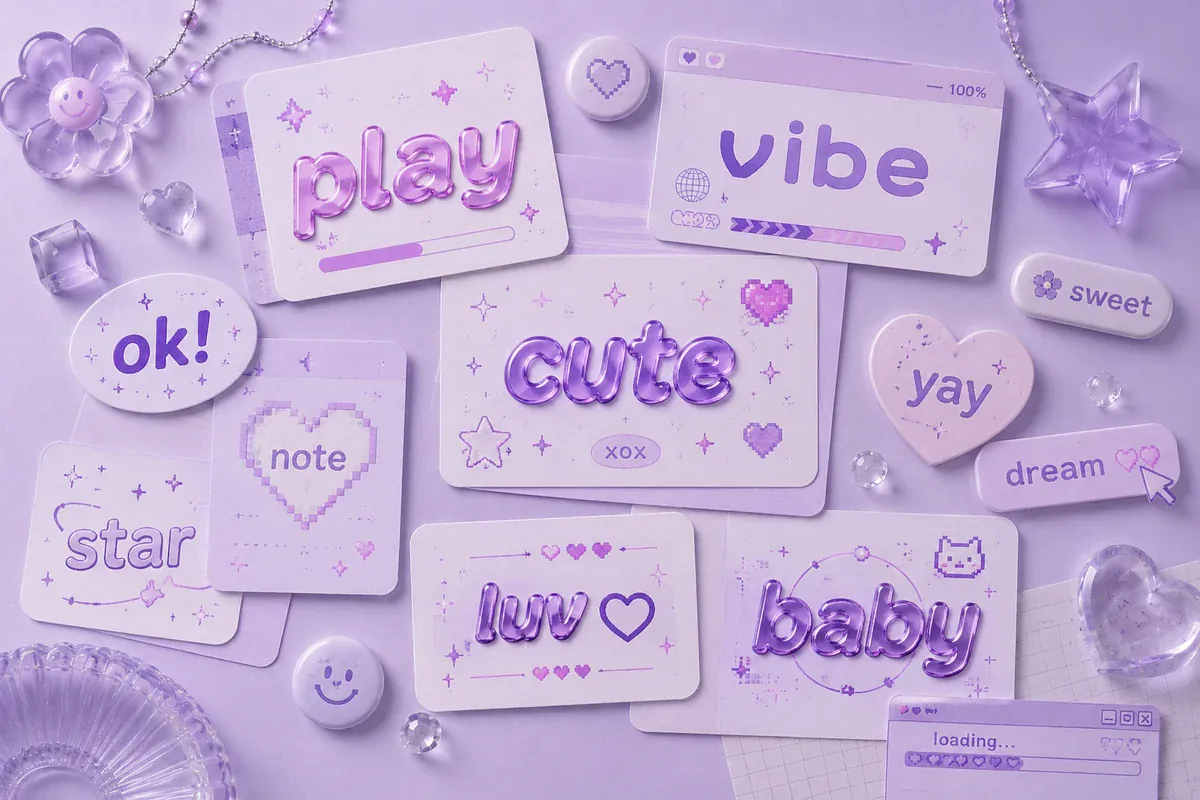
In the modern digital world, the way words look can be almost as important as what they say. People use text to express their personalities, share emotions, create attractive social media profiles, design digital invitations, and make everyday messages more memorable. A carefully styled phrase can turn a simple sentence into something visually appealing, whether it appears in a social media bio, a personal journal, a digital poster, or a creative message to a friend. This growing interest in visual communication has made text styling an important part of personal expression and online creativity.
Text aesthetic refers to the visual appearance and overall feeling created by written characters, fonts, symbols, spacing, and decorative arrangements. Some styles feel soft and romantic, while others appear bold, mysterious, playful, or modern. For example, a person who enjoys a minimalist look might prefer simple lowercase letters and generous spacing, whereas someone interested in a dreamy atmosphere might choose decorative symbols and flowing typography. The best approach depends on the message, the intended audience, and the mood a person wants to communicate.
As digital platforms continue to influence how people communicate, attractive typography has become useful for more than decoration. It can help establish a recognizable personal style, organize information, and draw attention to important messages. Understanding the different techniques behind text design makes it easier to create appealing content without sacrificing readability or meaning.
What Is Text Aesthetic?
Text aesthetic is the art of presenting written language in a visually pleasing and expressive way. It combines typography, letter shapes, capitalization, spacing, symbols, and sometimes emojis to create a particular atmosphere. Unlike ordinary writing, which primarily focuses on delivering information, aesthetic text also considers the visual experience of reading. A short phrase can appear elegant, cheerful, dramatic, or sophisticated depending on how its characters are arranged.
For example, the phrase “stay positive” can look completely different when written in a clean, minimalist style compared with a decorative script or a playful arrangement of symbols. The words remain the same, but their presentation changes the impression they create. This is particularly useful in digital environments, where people frequently make quick judgments based on visual details. A thoughtful combination of typography and spacing can help a message feel more personal and consistent with the creator’s identity.
The concept is not limited to fancy fonts. Color combinations in designed graphics, balanced layouts, consistent capitalization, and appropriate line breaks can all contribute to a pleasing result. Even plain text can feel aesthetic when it is arranged carefully. The central idea is to create harmony between the meaning of the words and their visual presentation.
Why Aesthetic Text Is Popular in Digital Communication
One important reason for the popularity of decorative text is the growing importance of personal identity online. Social profiles, messaging applications, digital communities, and creative platforms give users opportunities to present their interests and personalities. A distinctive display name or thoughtfully arranged bio can communicate a particular mood before someone reads the full profile. Small visual choices can therefore contribute to a recognizable digital identity.
Another reason is the influence of visual-first communication. People regularly encounter large amounts of information on their screens, making clear and attractive presentation valuable. Well-designed text can help a heading stand out, separate different ideas, or make a short announcement more engaging. However, visual decoration works best when it supports the message instead of distracting from it. Excessive symbols, unusual characters, or complicated letter shapes can make even a meaningful phrase difficult to understand.
Aesthetic typography also encourages creativity. Users can experiment with different styles until they discover a combination that feels natural to them. Some may prefer a calm, neutral appearance, while others enjoy expressive symbols and unusual lettering. There is no single style that works for every situation, because the most effective design depends on individual preferences and the purpose of the content.
Popular Styles for Creating Beautiful Text
Minimalist and Clean Typography
Minimalist typography focuses on simplicity, balance, and readability. It usually avoids excessive symbols, complicated letterforms, and unnecessary decoration. Lowercase lettering, consistent spacing, and short phrases are common choices for this style. For instance, a simple expression such as “little moments matter” can feel elegant when presented without additional visual clutter.
This approach is particularly useful for professional profiles, study notes, personal branding, and digital content that needs to remain easy to read. Minimalist styling also works well when a person wants their words to feel calm and organized. Rather than relying on decorative effects, it allows the message itself to become the main attraction.
Soft, Dreamy, and Romantic Styles
Soft typography often uses flowing scripts, delicate symbols, gentle spacing, and decorative elements associated with romantic or dreamy themes. Small stars, hearts, floral characters, and moon symbols can contribute to this atmosphere when used sparingly. A phrase such as “dream a little more” may feel more expressive when surrounded by subtle decorative details.
This style is popular for personal journals, mood boards, creative usernames, friendship messages, and lifestyle-themed content. The key is maintaining consistency. Combining too many unrelated symbols can make a design appear crowded, while a few carefully selected elements create a more polished effect.
Bold and Modern Typography
Bold typography emphasizes strong letterforms, contrast, and visual confidence. It can be useful for short announcements, gaming profiles, event headings, motivational messages, and promotional graphics. Large lettering or a strong typeface helps important information stand out immediately, particularly when readers are viewing content on a small screen.
Modern styles often combine bold headings with simpler supporting text. This contrast creates a clear visual hierarchy, allowing readers to identify the main message before exploring additional details. A bold style should still be selected carefully, because overly decorative characters may not display correctly on every device or platform.
Vintage and Retro Lettering
Vintage-inspired text draws from older printing styles, handwritten notes, classic posters, and nostalgic visual design. Depending on the intended period, it may feature serif lettering, ornamental details, or carefully arranged decorative elements. This style can create a sense of warmth, history, and individuality.
It works particularly well for themed invitations, creative projects, music-related graphics, personal collections, and digital designs inspired by earlier decades. Authenticity matters more than decoration alone. Selecting typography that matches the intended theme produces a more convincing result than combining random retro elements.
How to Create Your Own Text Style
Creating an attractive design does not require advanced graphic design knowledge. Most people can begin by choosing a phrase, deciding what emotion it should communicate, and testing different ways to present it. For example, a cheerful greeting might suit rounded lettering and playful symbols, while a serious quotation may benefit from clean typography and generous spacing.
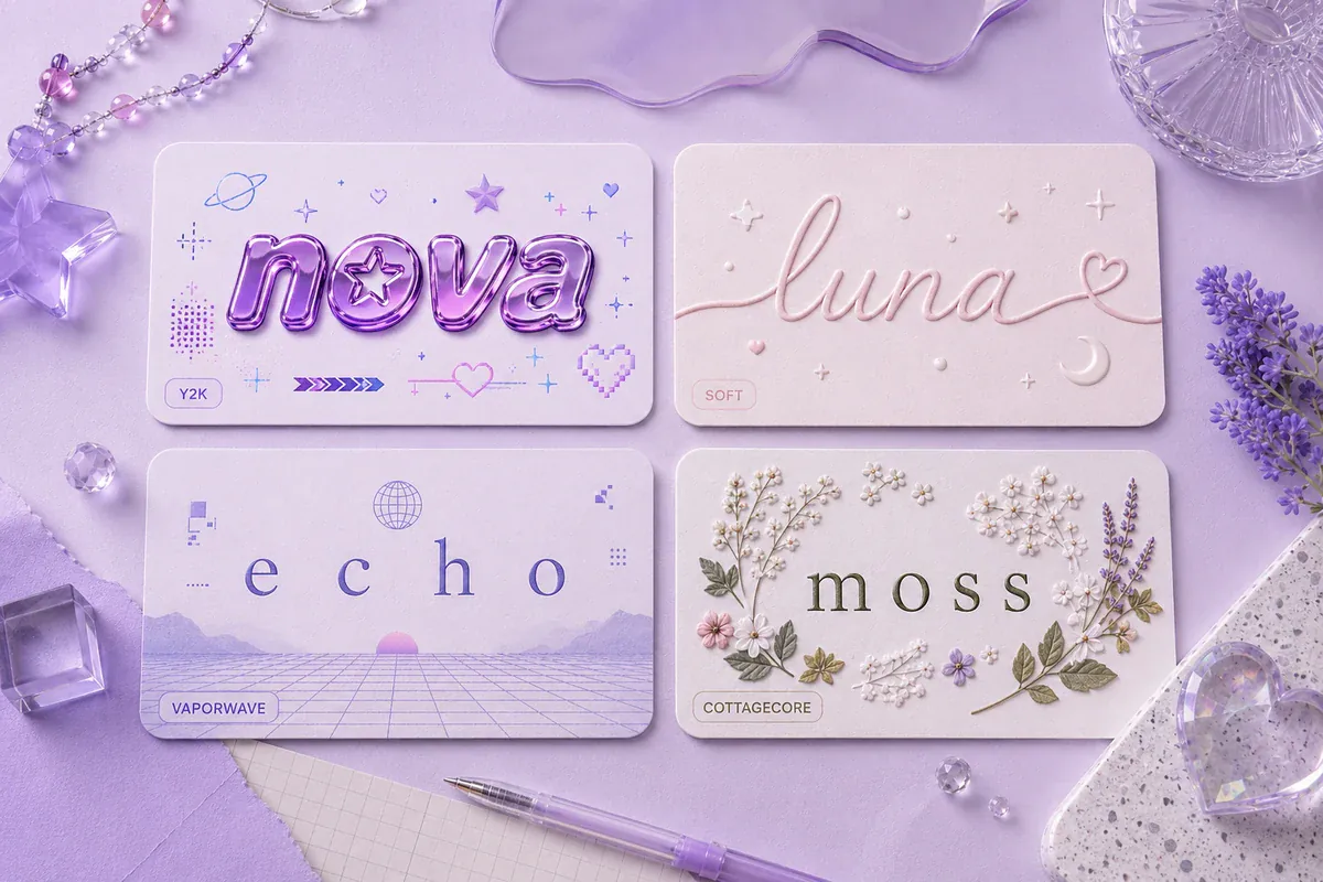
The phrase should remain the starting point rather than the decoration. If the message is too long, consider shortening it before experimenting with fonts. Shorter expressions are generally easier to style because they offer more flexibility with line breaks and visual balance. After selecting the wording, compare a few different styles and check which version communicates the intended feeling most clearly.
A simple process can make experimentation more effective:
- Choose a mood, such as minimal, romantic, bold, or nostalgic.
- Select lettering that matches the intended mood and audience.
- Add only a few complementary symbols or spacing effects.
- Preview the final result on the platform where it will appear.
Once the basic design feels balanced, test it at different screen sizes. A style that looks attractive on a desktop may become crowded on a mobile device. Checking the final appearance before publishing helps prevent unnecessary formatting problems.
Tools and Techniques for Styling Digital Text
Text generators and font-conversion tools can help users explore different lettering styles quickly. Many offer variations that can be copied into profile descriptions, messages, captions, or other text fields. These tools are especially useful for people who want to experiment without installing additional software or learning a complete design application.
However, generated text does not always behave like a traditional font. Some tools replace standard letters with Unicode characters that resemble different typefaces. These characters may look attractive but can have limitations. Certain devices may display them differently, assistive technologies may interpret them inconsistently, and some platforms may reject particular characters. Standard text with thoughtful spacing is often the safer option when accessibility and compatibility are priorities.
For more advanced projects, graphic design applications provide greater control over typography, color, alignment, and layout. They allow users to create custom headings, combine multiple typefaces, and adjust the spacing between letters. These features are useful for posters, digital invitations, presentations, and branded social media graphics.
The following table compares common approaches to text styling and their practical uses.
| Styling method | Visual effect | Best use |
|---|---|---|
| Minimalist lettering | Clean and balanced | Bios, notes, and professional content |
| Decorative Unicode characters | Distinctive and playful | Short names and profile highlights |
| Script typography | Elegant and flowing | Invitations and romantic messages |
| Bold typefaces | Strong and noticeable | Headlines and announcements |
| Retro typography | Nostalgic and expressive | Themed graphics and creative projects |
Choosing a method according to its purpose helps prevent unnecessary complexity. A decorative generator may be ideal for a short username, whereas a design application is better for a complete poster with multiple text elements.
Using Text Aesthetic on Social Media
Social media provides many opportunities to experiment with typography and personal presentation. Profile descriptions, captions, display names, story graphics, and pinned posts can all benefit from consistent visual choices. Someone who prefers a calm and minimal identity might use short phrases, simple punctuation, and clean layouts across their content. Another creator may choose expressive lettering and decorative symbols to establish a more playful personality.
Consistency is particularly important when creating a recognizable online presence. Repeating a small set of visual elements can make content feel connected without making every post identical. For example, a creator might use one lettering style for headings, another for supporting text, and the same subtle symbol to mark recurring content categories. This approach creates a visual pattern that audiences can recognize over time.
It is also important to consider the platform’s formatting restrictions. Some applications support only basic text, while others allow richer formatting through images, stories, or design tools. A decorative character that works in a profile description may not appear correctly in a username or search field. Testing the final version before using it publicly can save time and help maintain a consistent appearance.
Common Mistakes to Avoid When Styling Text
One frequent mistake is adding too many decorative elements to a short message. Although symbols and unusual characters can create personality, excessive decoration may reduce readability. When every word has a different style, readers have difficulty identifying the main point. A more effective approach is to choose one dominant style and use additional elements only where they improve the design.
Another problem is choosing appearance over accessibility. Extremely unusual characters may be difficult for screen readers to interpret, and some people may struggle to recognize stylized letters. This matters especially for educational information, important announcements, professional communication, and instructions. In these situations, standard characters and clear formatting are usually the better choice.
Other common issues include inconsistent spacing, poor contrast in graphics, and selecting lettering that does not match the message. A playful design may be appropriate for a personal greeting but unsuitable for a formal business announcement. Similarly, an elegant script may look attractive in a large heading but become difficult to read when reduced to a small size.
A useful principle is to review every design from the reader’s perspective. Ask whether the message is immediately understandable, whether the visual elements serve a purpose, and whether the style matches the intended audience. Removing one unnecessary decoration can sometimes improve the overall result more than adding several new ones.
The Role of Text Styling in Personal Branding and Creativity
Typography can contribute significantly to personal branding because visual consistency helps people recognize a creator or business. A consistent approach to headings, captions, and graphic layouts communicates attention to detail. Although decorative text alone cannot establish a strong brand, it can support a broader identity built around clear messaging, useful content, and recognizable visual choices.

For individual creators, experimenting with different styles can also become a form of self-expression. A person may use clean lettering for professional content, playful symbols for casual updates, and elegant typography for special occasions. These variations allow creativity while preserving an overall sense of personality. The most successful designs usually feel intentional rather than copied from a trend without considering the context.
Businesses should approach decorative typography somewhat differently. Their priorities often include readability, consistency, accessibility, and brand recognition. A carefully selected typeface can communicate professionalism and make information easier to navigate. Unusual characters may be appropriate for a short campaign graphic, but standard text is often more practical for customer instructions, product descriptions, and important service information.
Conclusion
Text styling has become an accessible way to make digital communication more expressive, organized, and visually engaging. From minimalist lettering and soft decorative symbols to bold headlines and vintage-inspired typography, different approaches can create different impressions without changing the meaning of the words themselves. The best choice depends on the intended audience, the platform, and the feeling the creator wants to communicate.
Exploring text aesthetic techniques can help anyone develop a more distinctive digital style. Start with clear wording, choose a visual direction, experiment with spacing and lettering, and use decoration only when it adds value. Remember to test compatibility and readability before publishing, particularly when using unusual Unicode characters. With a balanced approach, even a short phrase can become memorable, attractive, and meaningful while remaining easy for others to understand.